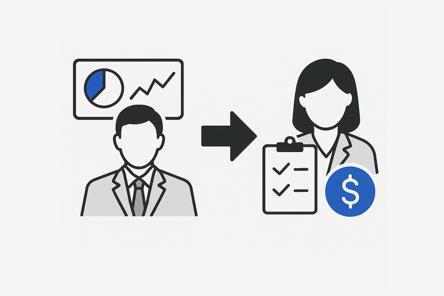
Guiding Tax Filers Toward Smarter Financial Choices
Optimising User Navigation to Increase Task Completion Rate
Before
Fragmented workflows
User frustration and confusion
High abandonment rates
Manual intervention required
After
Structured, intuitive portal
Clear user guidance
Streamlined task completion
Automated processes
90%
Completion Rate
Increase in successful task completion
20%
Task Time
Reduction in average completion time
80%
User Adoption
Growth in new user onboarding
10%
Manual Steps
Decrease in manual intervention needed
Team & touchpoints
Cross-Functional: one developer, CPA Financial Advisors, 2 interns, and me as the UX lead.
Recurring touchpoints: daily syncs, weekly dev and client check-ins, monthly stakeholder reviews.
Measurable Success Metrics
Task completion rates
Time taken per upload
Goals
Reduction in manual outreach
Increase in new users adopting the portal
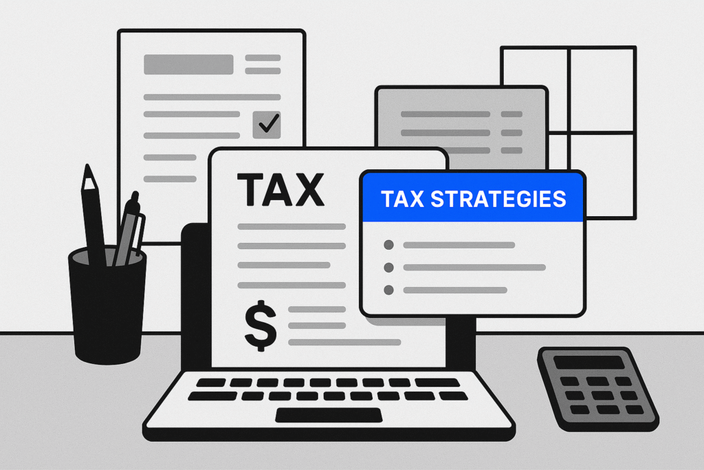
Understanding the tool
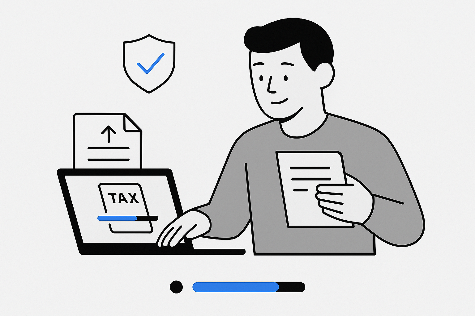
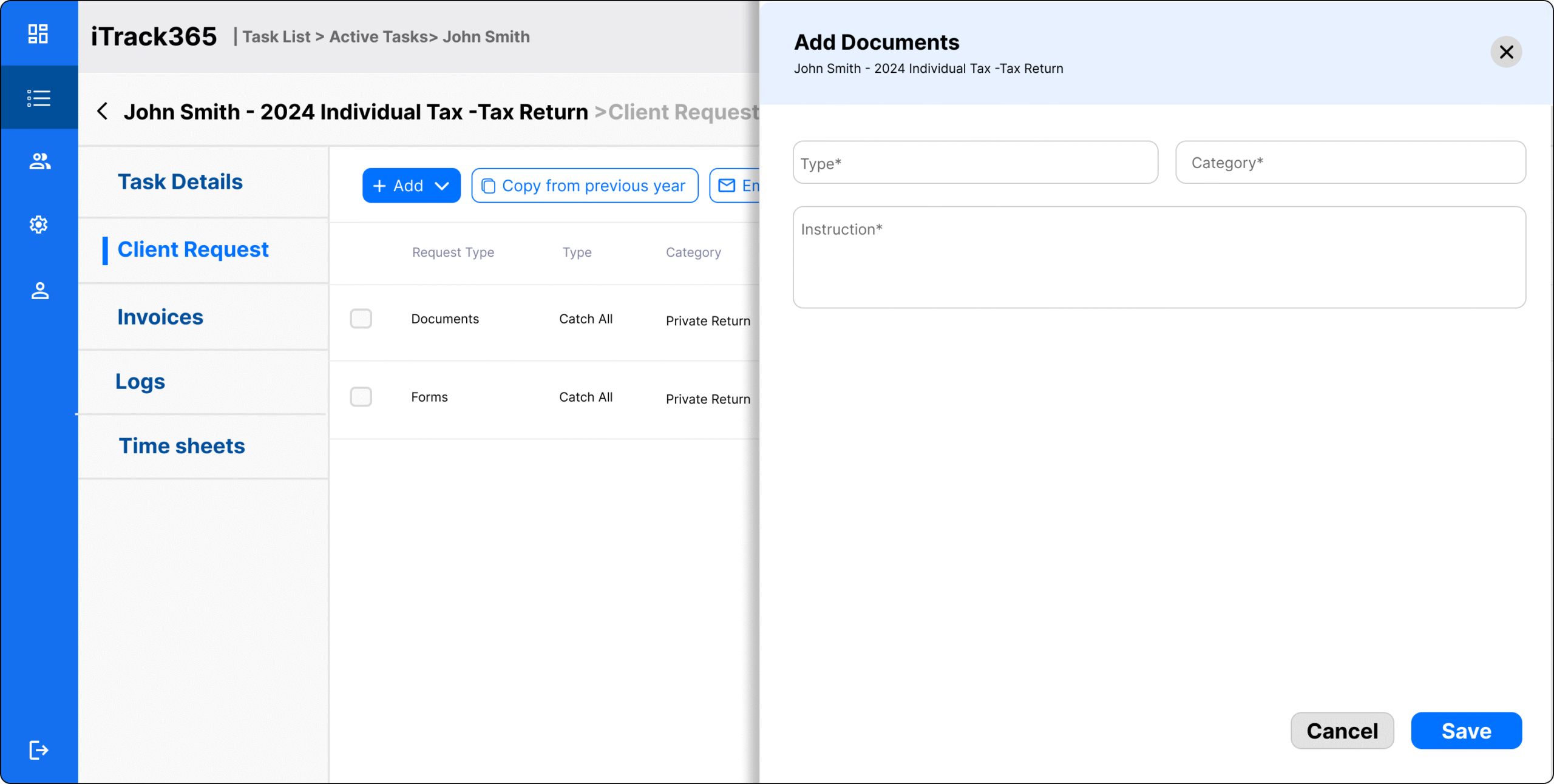
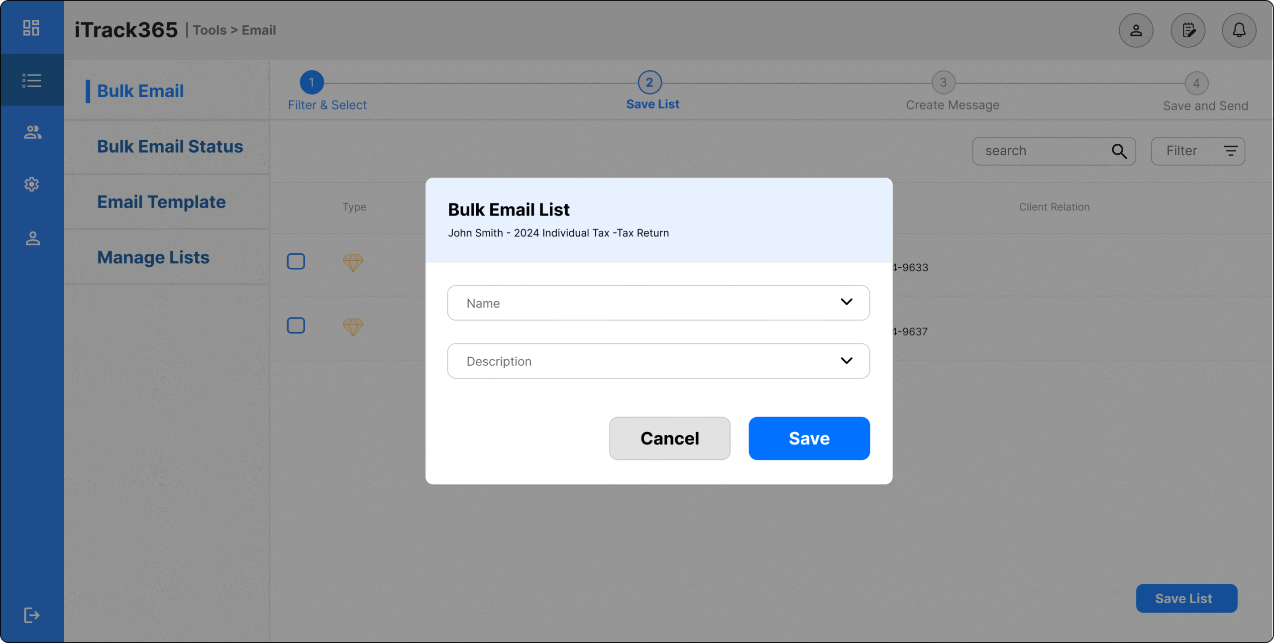
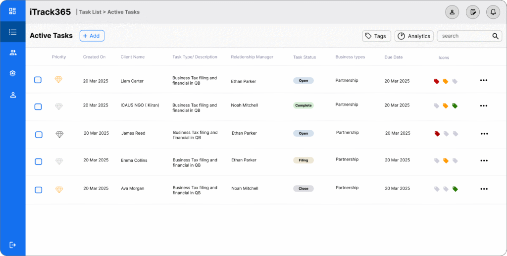
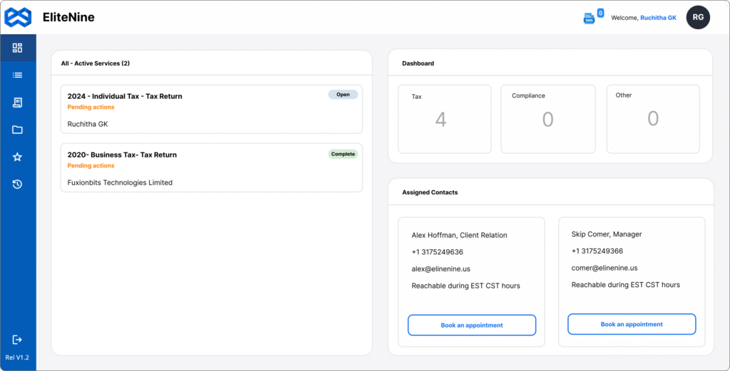
The portal supports the end-to-end tax filing process for small business clients.
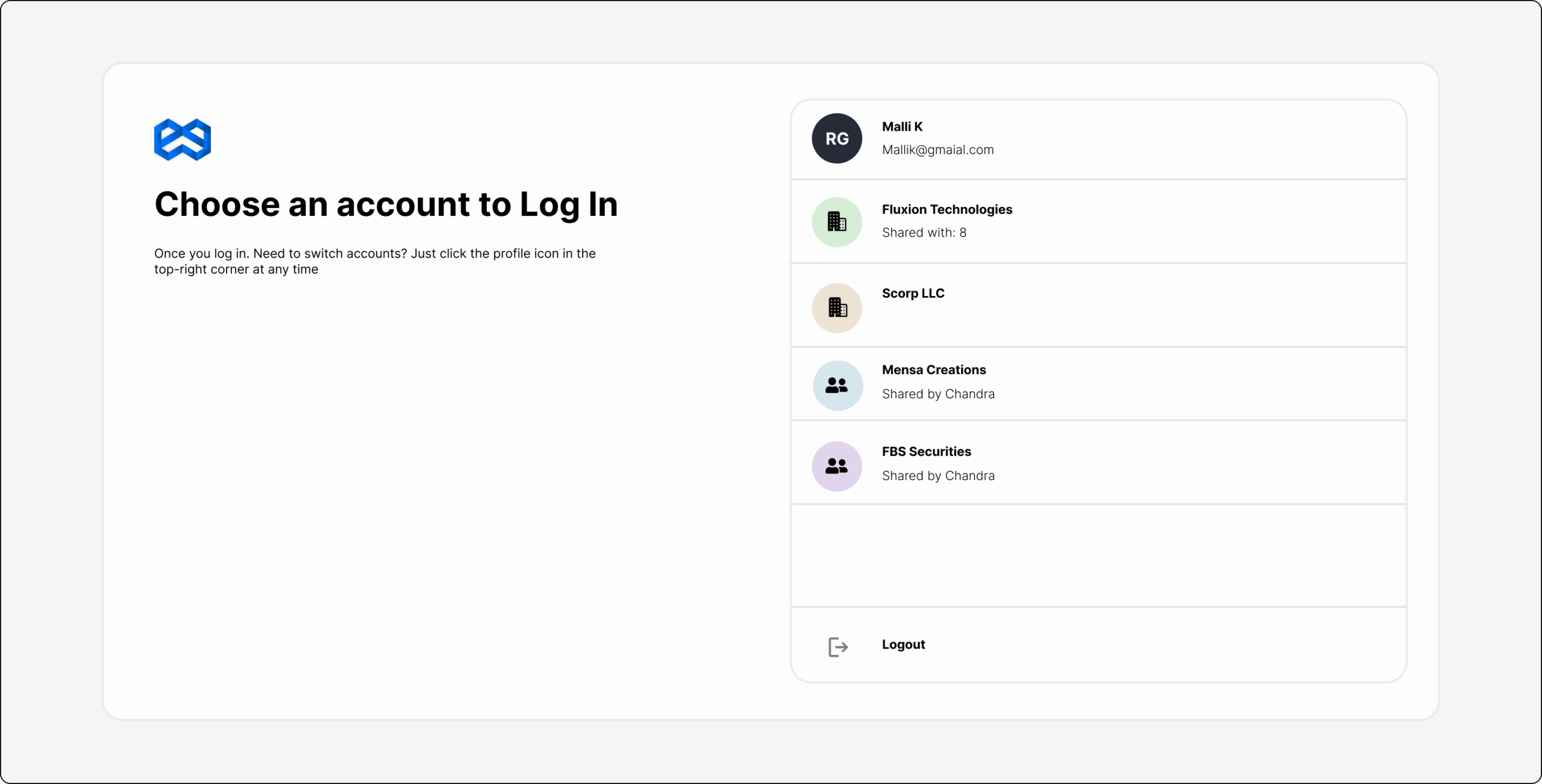
User-driven at onboarding: Business owners log in, set up accounts, and upload required tax forms.
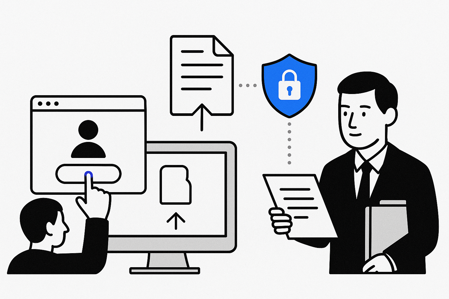
Secure and compliant: All uploads follow strict data security and regulatory standards.
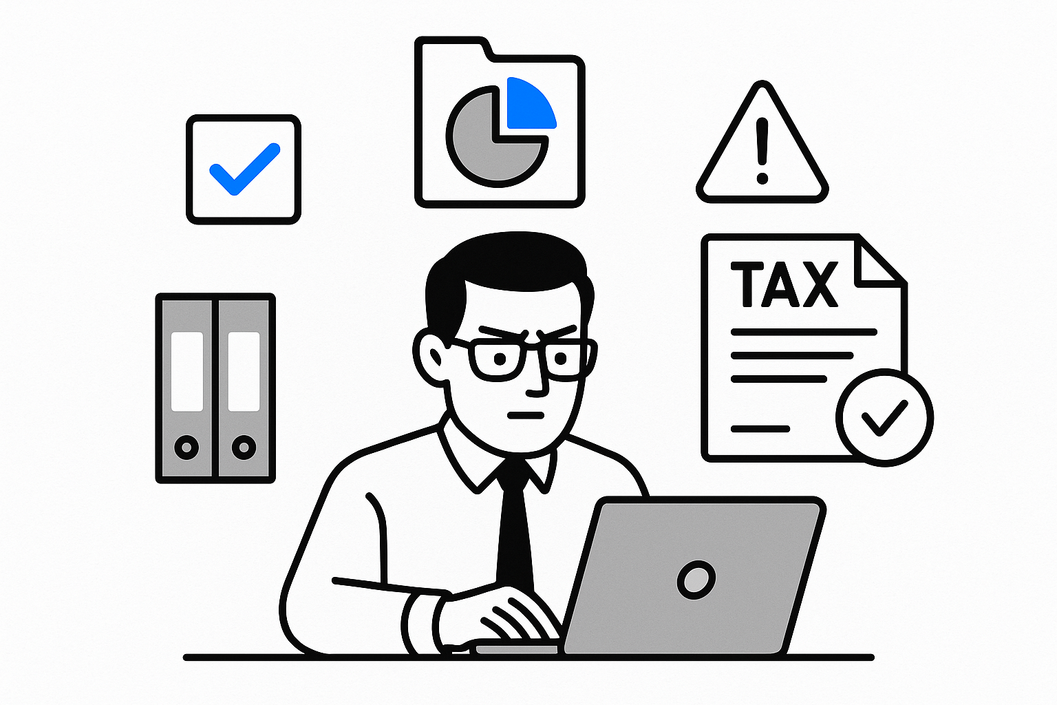
CPA-driven later: Once forms are submitted, CPAs review, validate, and process filings through their internal admin view.
Admin oversight: Supervisors and CPAs manage workflows, ensuring accuracy, compliance, and timely submission.
Understanding the users
Persona 1 – Small Business Owner
Goal: Quickly upload tax documents and ensure compliance.
Behavior: Wants a simple, step-by-step guided flow with clear progress tracking.
Value: Trusts the portal as the “first touchpoint” with the company.
Persona 2 – CPA and Tax Accountant
Goal: Efficiently review, categorize, and process client submissions.
Behavior: Relies on structured document organization, alerts for missing items, and audit-compliant records.
Value: Needs accuracy and efficiency to serve multiple clients at once.
Organisation Context
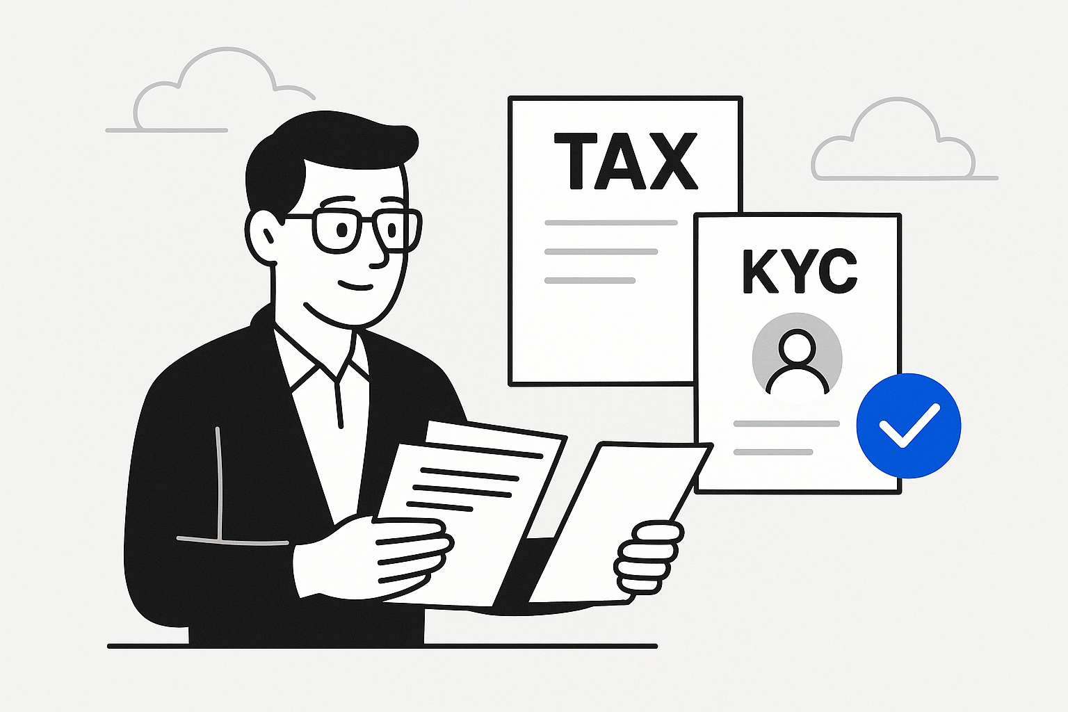
FBS Securities is a wealth management and investment firm.
CPAs collect and review tax forms and KYCs from clients.
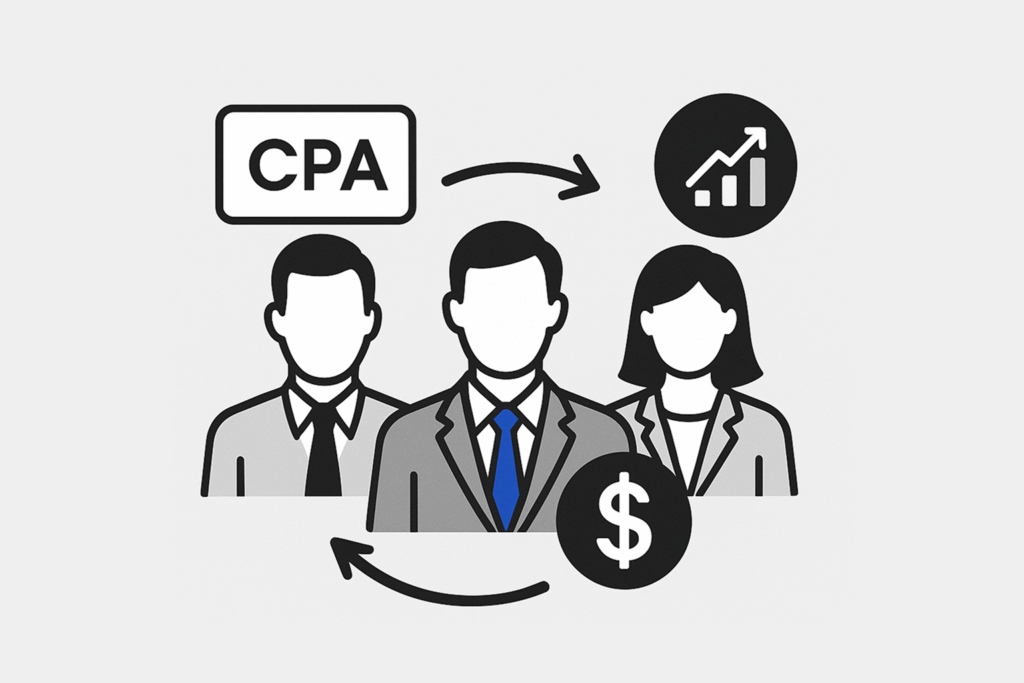
When a client is a High-Net-Worth Individual (HNWI), they are referred.
Portfolio Managers → assess risk and investment balance.
Financial Planners → advise on investment and tax saving
Business Objective
Improve the company’s most profitable product for cross-selling opportunities
This tool handled the most critical process: small business owners uploading tax forms for CPAs.
Improving it meant higher client satisfaction and retention.
An opportunity to cross-sell wealth management, investment, and advisory services, since understanding client tax data opens doors to broader financial solutions.
It was the organization’s highest profit-making product, so redesigning it delivered maximum impact.
User Research
Competitor/ Market Analysis
Looking at successful tools in the market showed us what features worked, what gaps existed, and where users still struggled.
Creating a comparison table helped us see patterns and decide which practices to adopt, adapt, or avoid.
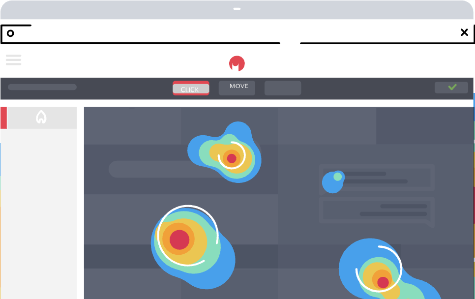
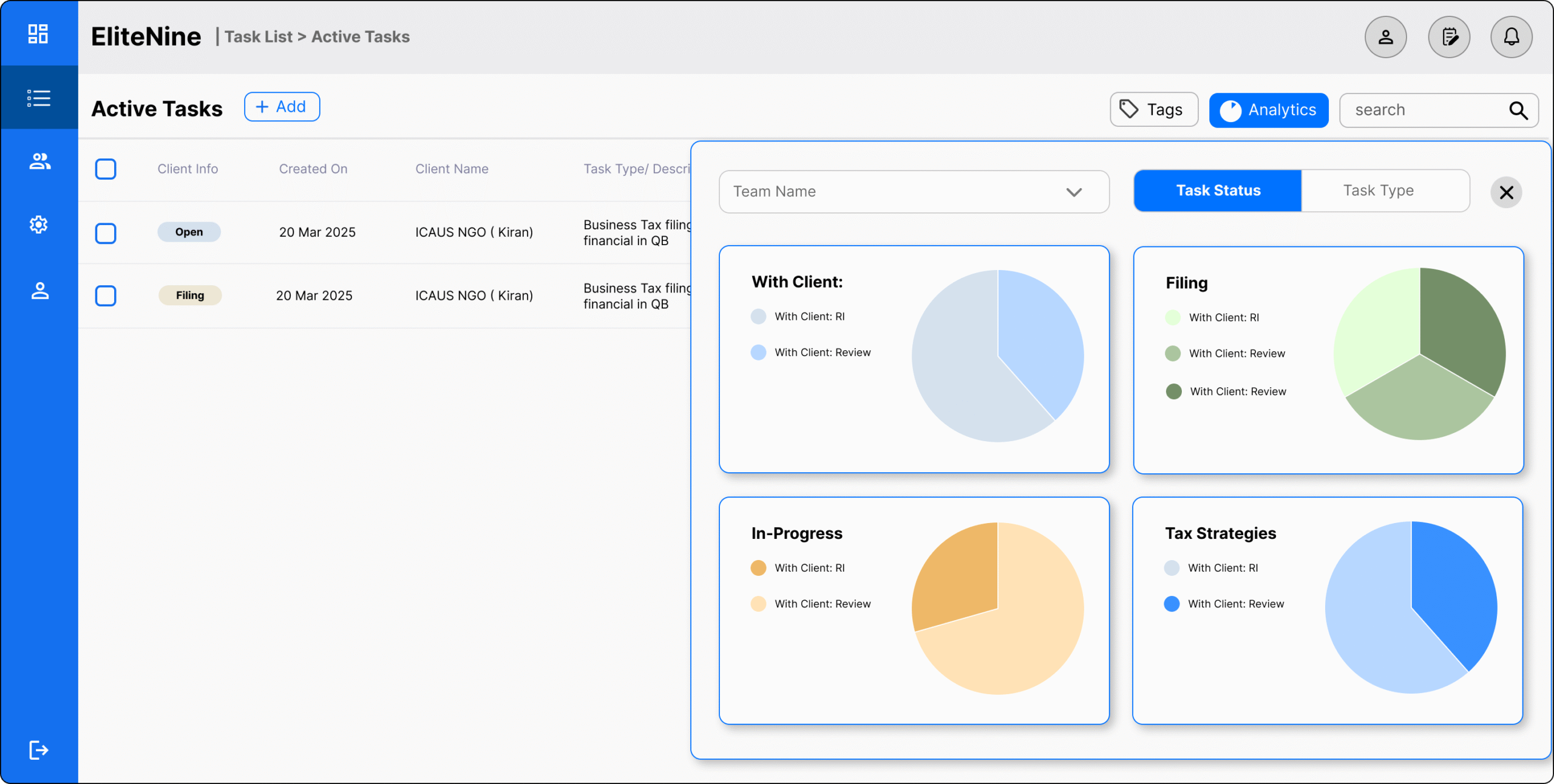
Heatmaps and GA4
Hard data on user behavior.
We saw which areas were clicked most, where users clicked repeatedly in confusion, where they dropped off without finishing tasks, and which pages attracted or lost attention.
Think aloud tasks
Added context behind the numbers.
Hearing users narrate their thought process revealed why they struggled, what caused hesitation, and what led to bounce-offs, insights we couldn’t capture with analytics alone.
Replaceable with Usertesting.com
Analysis
Card Sorting / Thematic Analysis
First-click testing showed how users grouped content and where they expected to find key actions.
It highlighted mismatches between our layout and their mental models, and pointed out early bounce spots when navigation felt unclear.
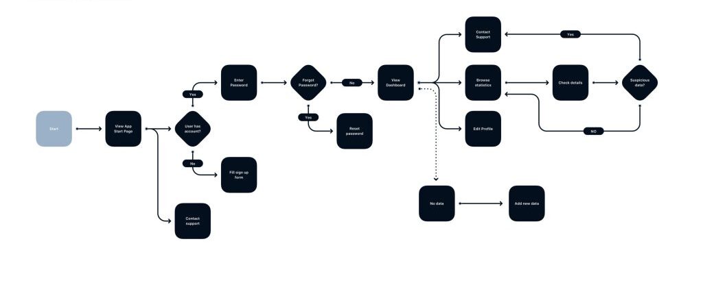
Userflow / User Journey Mapping
Mapping user flows exposed choke points where tasks slowed down or broke.
Reviewing the information architecture made it clear which steps added friction and which could be streamlined, giving us a blueprint for a cleaner, more intuitive structure.
Problem #1
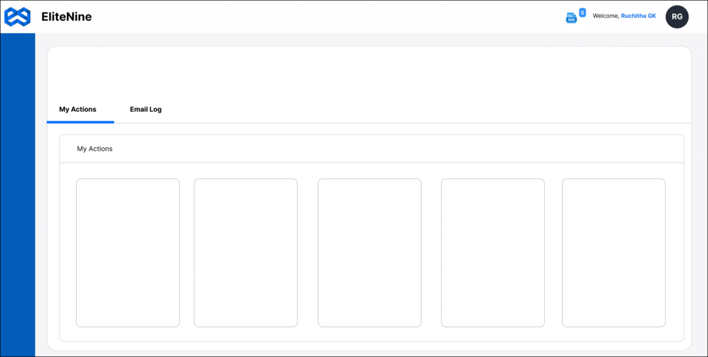
The dashboard had no clear starting point.
Bright colors competed for attention, while the actual call-to-action was hidden as a small underlined link under other elements.
Users were left unsure where to go to complete their task.
Problem #2
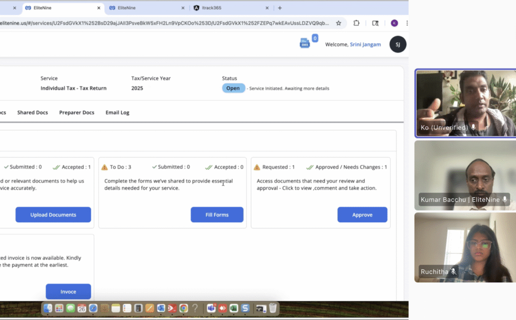
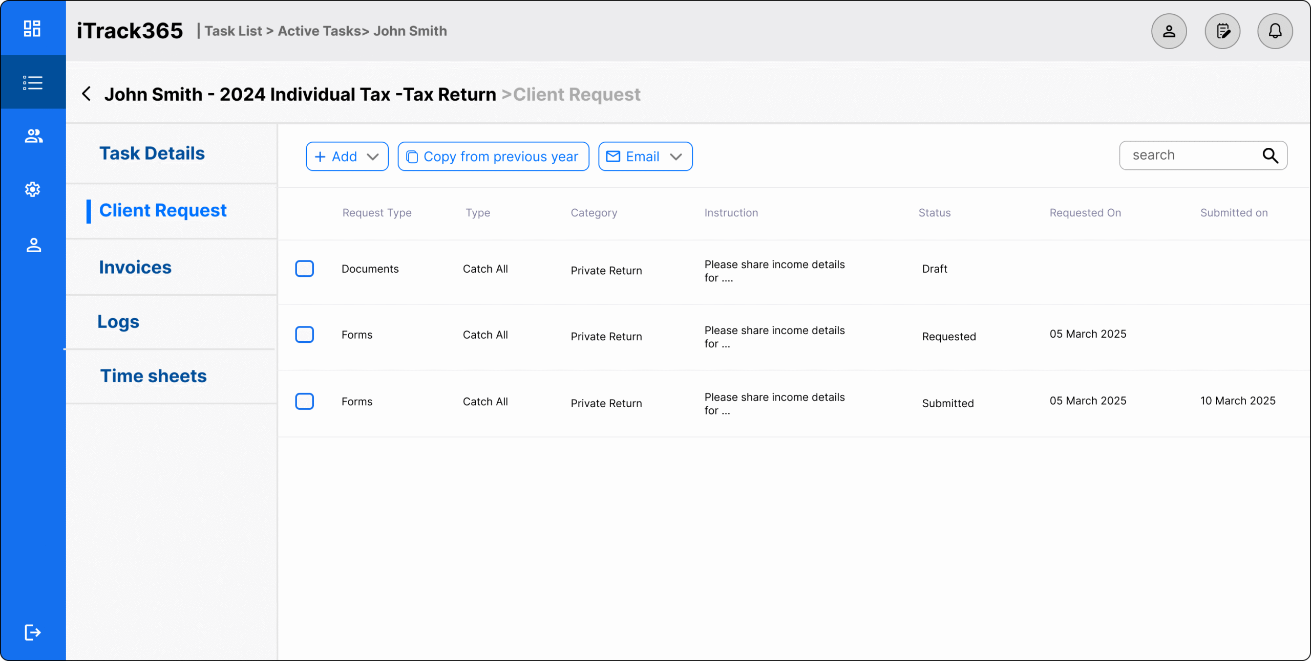
When asked to upload documents, users expected to find that option under headings like My Docs or Shared Docs.
Instead, the upload button was tucked away in the bottom
This mismatch in information architecture caused wasted clicks and user frustration.
Problem #3
Even after finding the task, the flow added unnecessary steps like “Show More.”
The system flagged items as incomplete without showing which ones were complete, leaving icons meaningless.
From a heuristic standpoint, this slowed users down and increased confusion.
Low Fidelity Prototypes
Stakeholder testing and feedback
Low-fi is quick to edit, which lets us compare which version aligns better with business goals, which design can scale more easily in the future, and which option is realistic for the developer to implement.
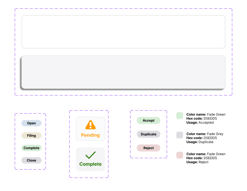
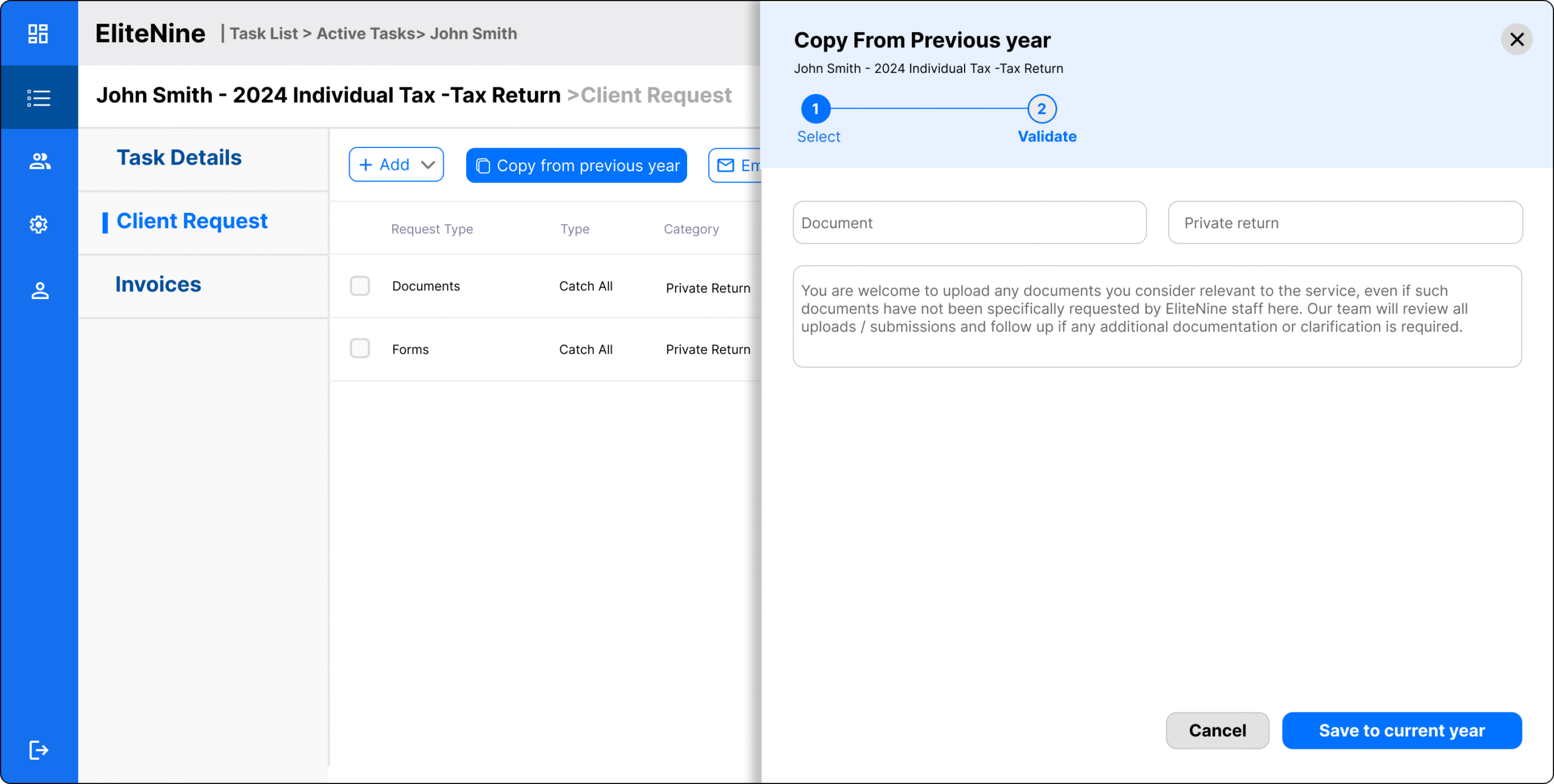
Solution #1
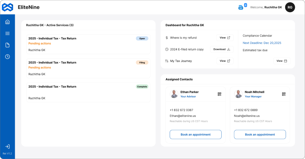
Clear Dashboard Cues
Added a visible pending-action cue so users instantly know what to do. On hover, the cue pops up- easy interaction.
Used WCAG-compliant colors and priority-based highlighting so users see the right information first.
Tax filing progression is silenced for users (since it’s not important to them) but remains emphasized in the CPA portal.
Solution #2
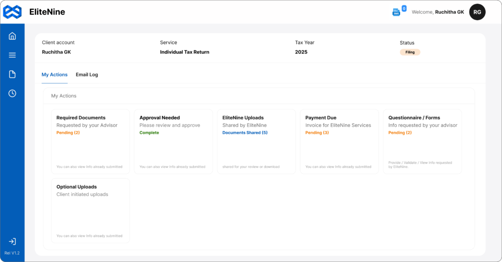
Organized Onboarding
Simplified information architecture with clear headings that explain what each section means.
Files organized and named consistently, users can distinguish between:
Completed documents, Pending uploads
and View-only files
Users don’t waste time guessing where to upload, it’s now intuitive.
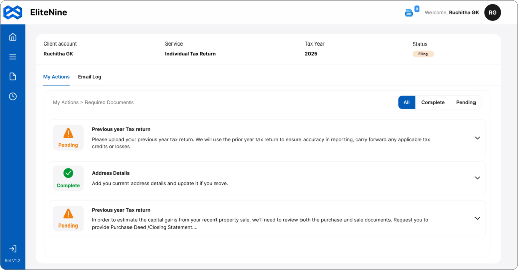
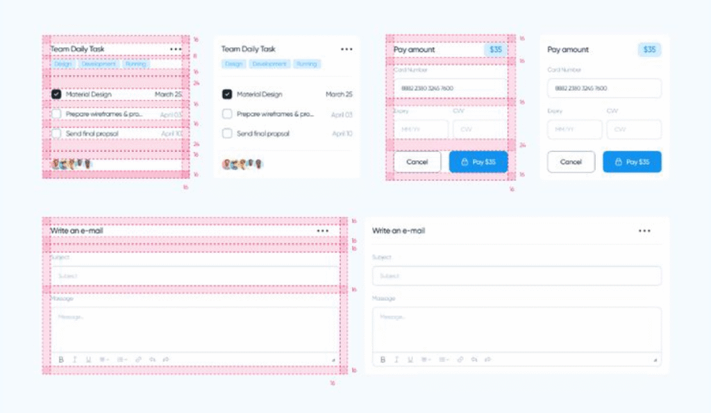
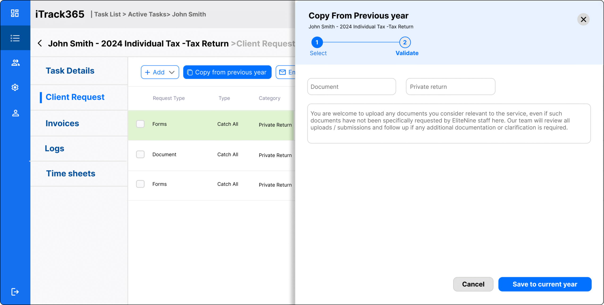
Solution #3
Streamlined Steps
Each action is clearly differentiated before the user starts.
Upload happens in one step: when a user clicks Family Details, the upload option appears immediately.
Removed unnecessary expansions, reduced clicks and time to complete tasks.
WCAG 2.1 AA color contrast ratios, spacing, and keyboard navigation.
Developer Handoff
Building with Tech in Mind from Day One
Learnt the team’s framework to choose compatible design systems: Since we used Angular (by Google) in the front end, paired with Material UI. Choose design system libraries that match their tech stack and naming
Discussed scope and goals: Component reuse, load time goals, and accessibility. Aligned design sprints with dev capacity + release milestones
1. Traditional Handoff
Grid-based layouts, pixel-perfect screens
Clean layers, labeled components, spacing, and token specs
Exported design tokens (JSON) for colors, spacing, typography
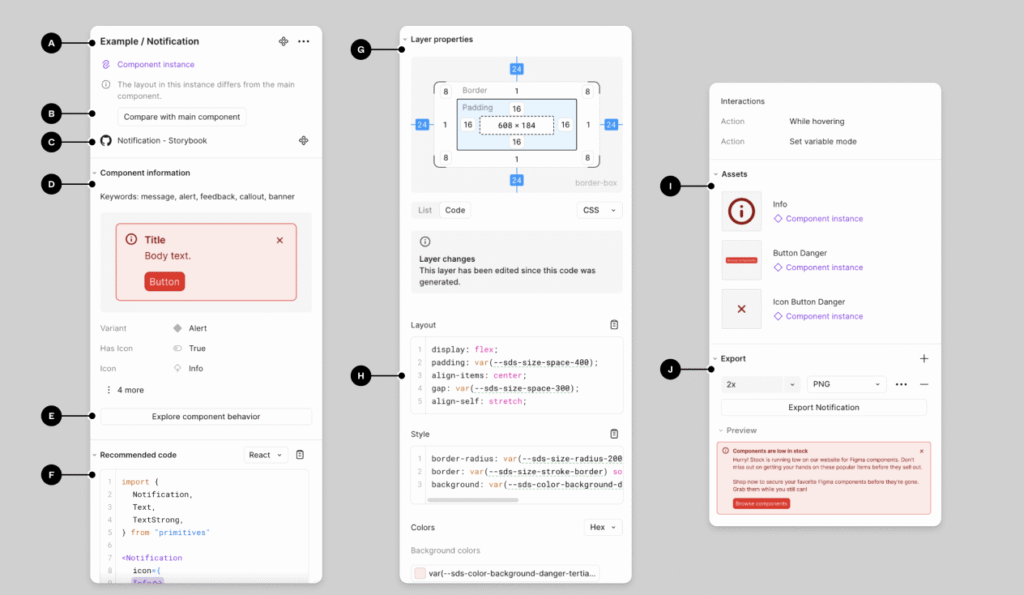
2. Figma Code Connect
Mapped each Figma component to its real code component
Kept design and code in sync during rapid iteration
Great for our agile team with live builds
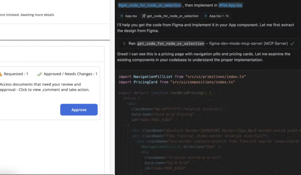
3. MCP Server
Enabled export: Converts Figma designs into ready CSS stylesheets
Dev pasted the link in VS Code
Future Explorations
Interconnected workflows & 40+ screens from the 2nd iteration.
Let me walk you through our second iteration over a call 🙂
Future Explorations
A 75% Drop in Notifications Sparked the Next Phase
we decided to digitize the backend to support this new efficiency long-term.


